Inspiration and Research
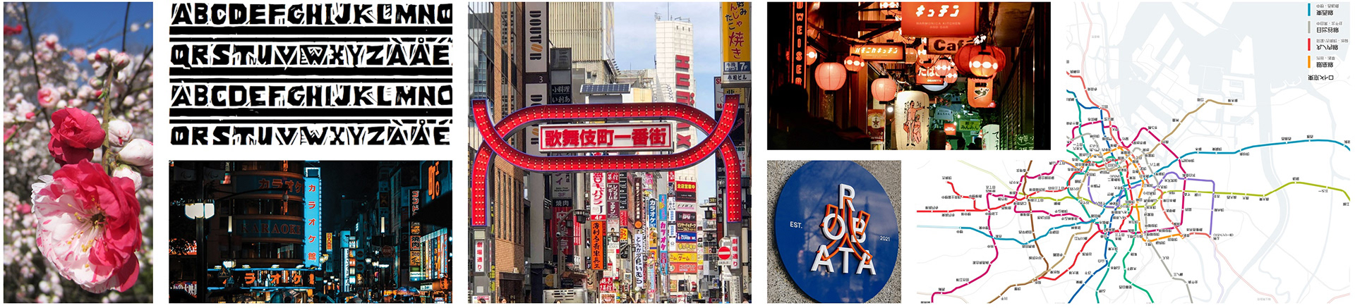
I started this project by getting inspired! I set out to visually capture the essence of Tokyo in a way that would resonate with a younger demographic. I explored a wide range of materials to understand the historical and cultural context by immersing myself in imagery of Tokyo, studying Japanese typefaces, and analyzing existing logos to assess the competitive landscape.
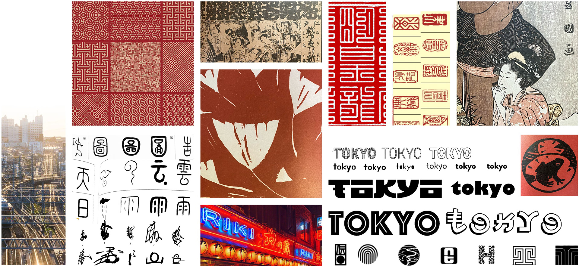
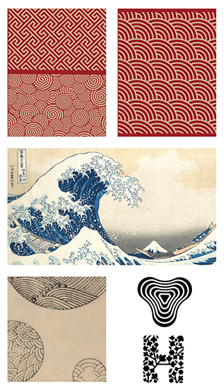
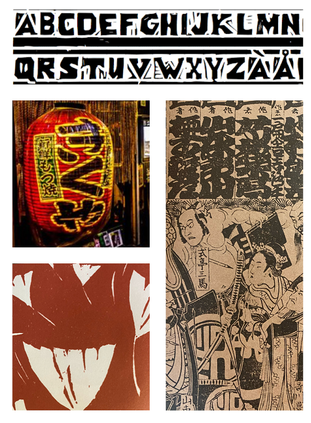
I was drawn to Japanese patterns, traditional hanko stamps, woodblock prints, neon signs, Japanese writing systems, and the city's maze-like subways and streets. I made notes on history, landscape, food culture, and important landmarks or events that make Tokyo unique, which helped me pinpoint ideas that I wanted to expand on.
Generating Ideas
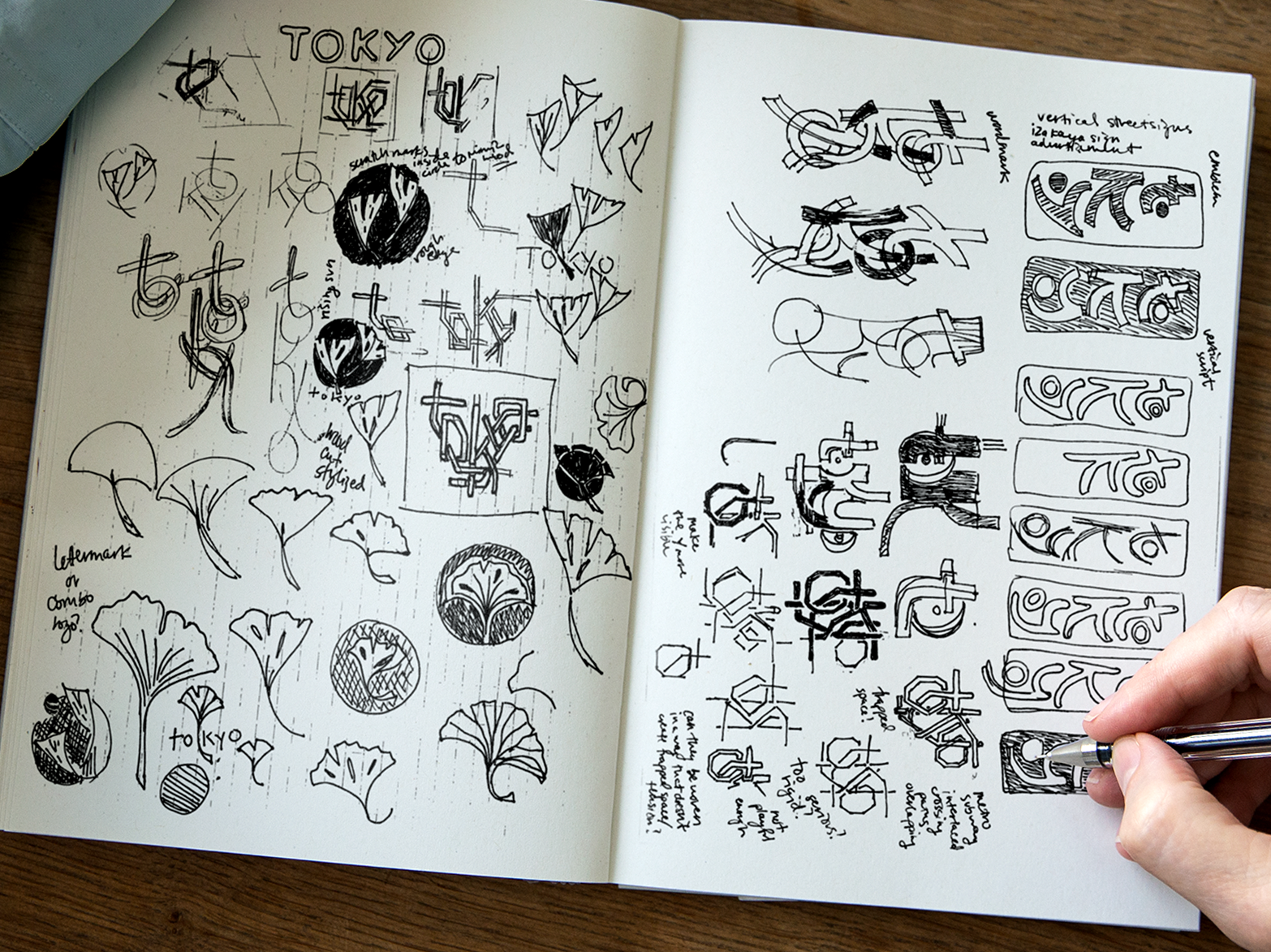
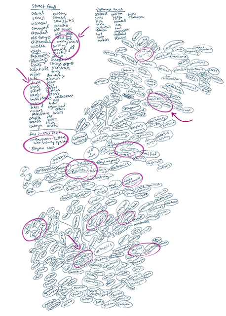
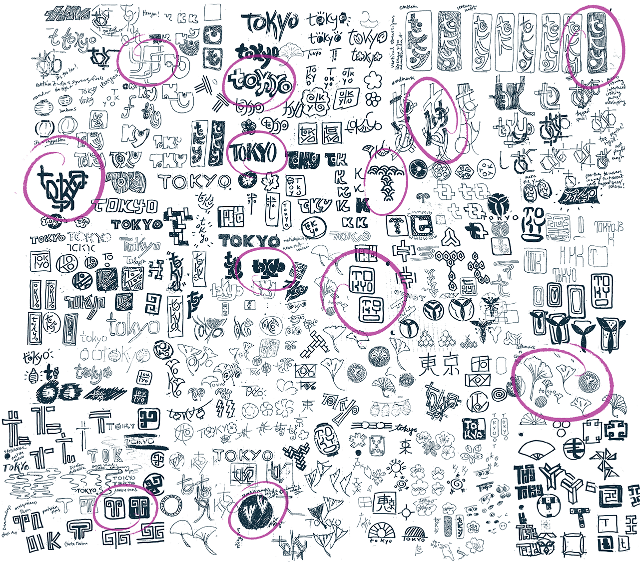
I sketch a lot. This is one of the most important parts of my process working on any project. After digging into some mind maps and word lists to help tease out repeating themes, I pulled any and all ideas out of my head with pen and paper. Then I let things percolate for a bit before distilling my ideas down to three main concepts.
—— ——————————— —————— ———————————— —
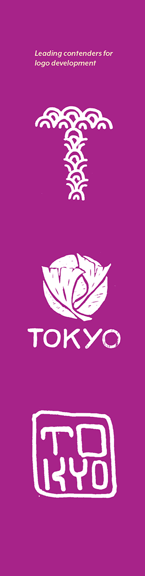
Logo Option 1 | Lettermark

The lettermark was inspired by a traditional wave pattern, a popular motif seen throughout Japan that pays homage to the ocean surrounding the archipelago. The repeating waves suggest movement and play while highlighting cultural tradition. Pairing the mark with a rounded, sans-serif font introduces modern sensibilities with a playful touch.
Looking for ways to incorporate shape and pattern as the defining structure of the letterform
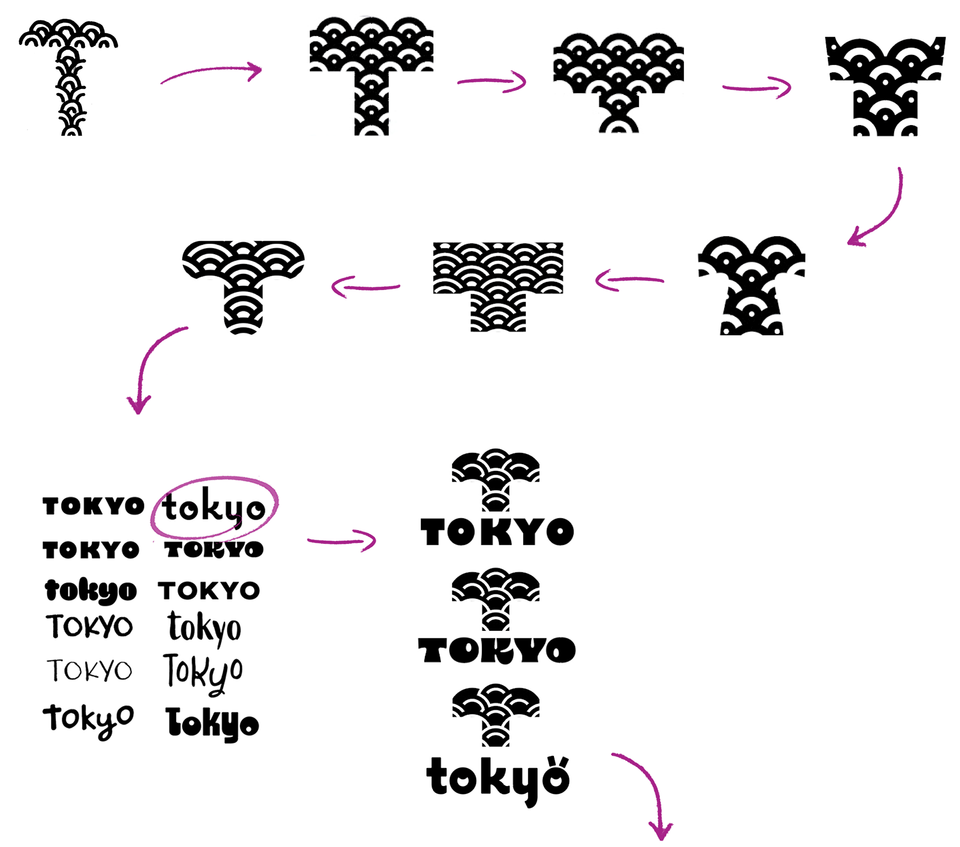
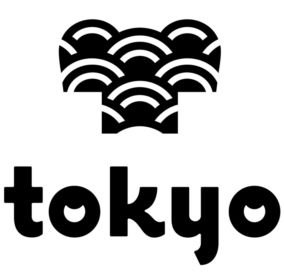
option #1 final design
—— ——————————— —————— ———————————— —
Logo Option 2 | Wordmark
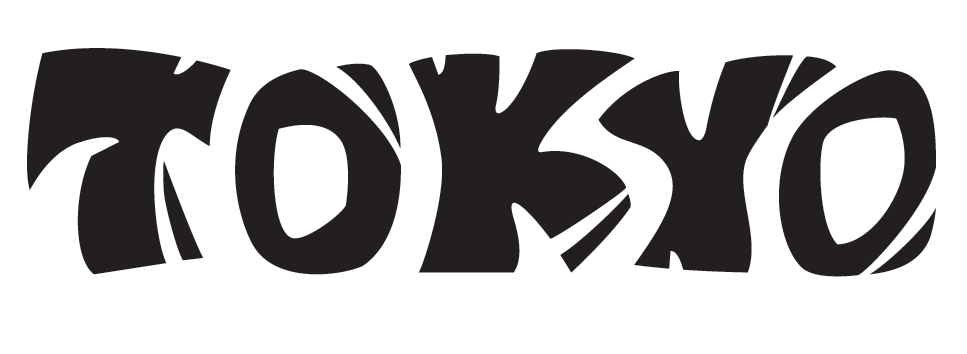
Initially, I was working on a logo suggestive of Tokyo's existing emblem, the ginkgo leaf, with Japanese woodblock printing (mokuhanga) as my primary inspiration. Along the way, I realized I could create a more successful logo by focusing on customizing the type as a wordmark instead. In order to more authentically represent the woodcut aesthetic, I used examples of wood type and kanji as references and got to work on my own hand-carved relief print, my first time ever attempting it. The resulting logo's bold forms hearken back to the natural imperfections found in woodblock prints and conjure a nostalgia for traditional craftsmanship with a contemporary twist.
Thinking about block printing aesthetics and how Japanese script is constructed
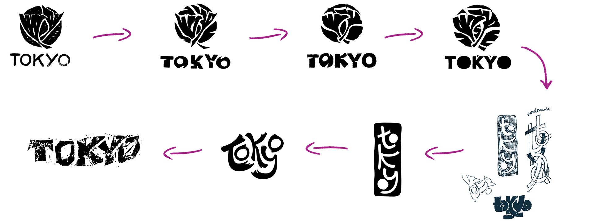
Switching gears partway, I collected other ideas from my early sketches, and considered alternative ways of playing with the type
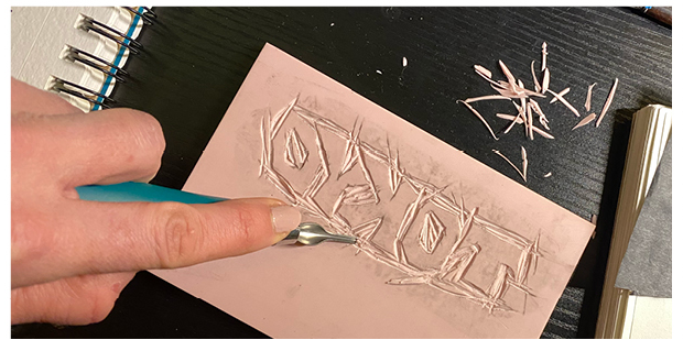
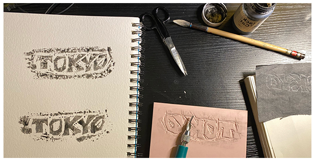
Getting hands-on with relief printing!
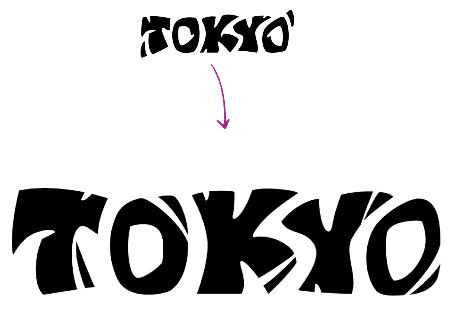
option #2 final design
—— ——————————— —————— ———————————— —
Logo Option 3 | Combination Mark
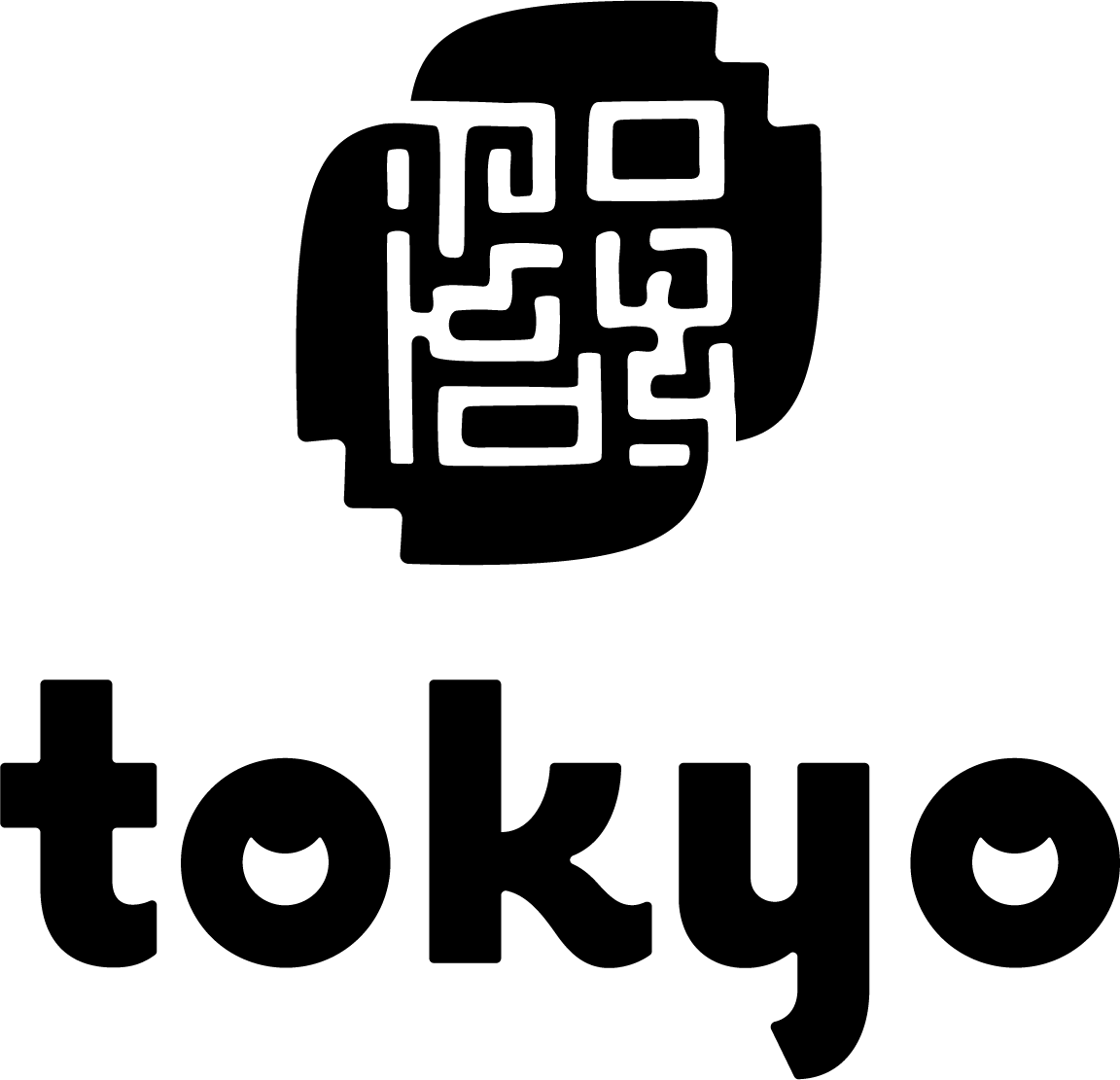
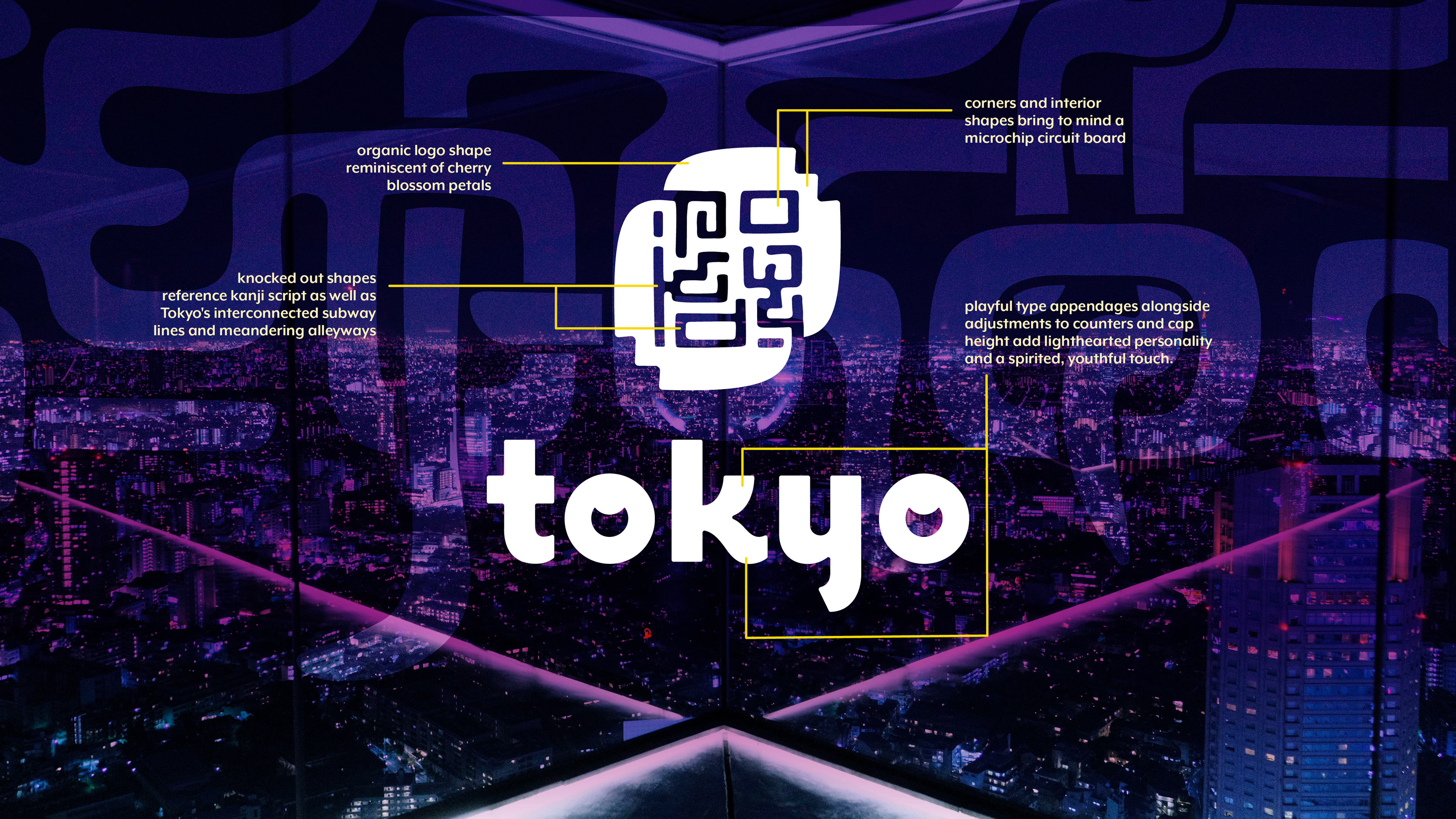
This option synthesized all the themes I had been exploring so far: movement, play, connection, tradition, and modernity. My primary inspirations for this version were hanko stamps and Tokyo's subway system—my goal was to create something unique for Tokyo that referenced their visual language. I accomplished this by abstracting the Roman letters in "Tokyo" into a maze-like construction. The final logo alludes to kanji, hanko stamps, and subway lines with a subtle nod to cherry blossoms and tech, while evoking a vintage-modern aesthetic.
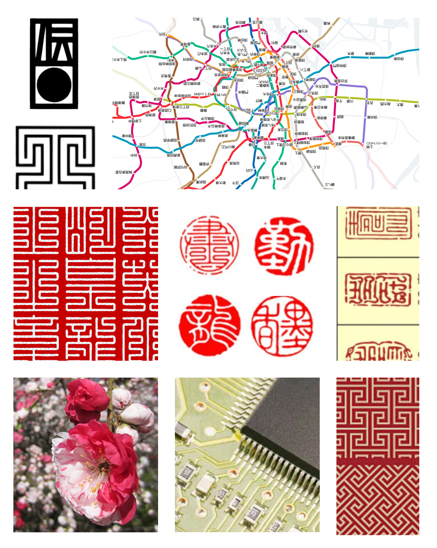
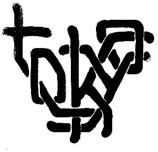
This early sketch of an abstract subway map spelling out "Tokyo" had a big impact on logo development and brand identity as a whole
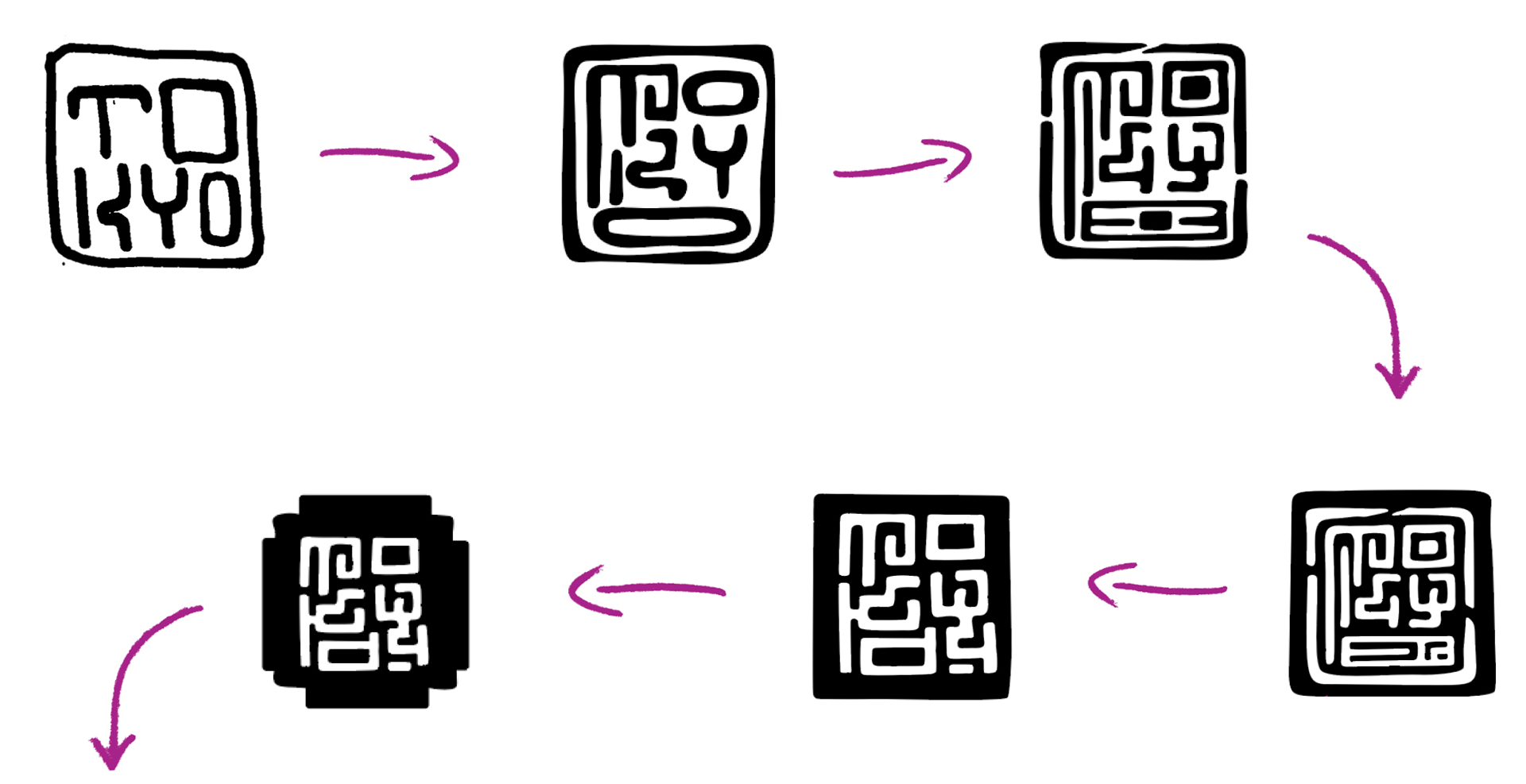
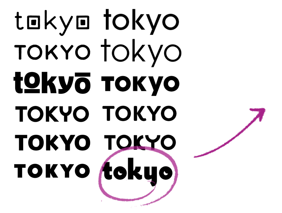
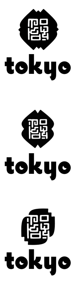
Last look at font pairings (switched from retro-modern grotesque to the rounded typeface already used by the lettermark) and reexamined the outer shape to add more visual interest

final logo design!